
The Coppertops Guide to Responsive Websites
Have you tested your website to see how it works on mobile devices? Does it look and feel as it should? It may not be identical but should still have a similar experience for your user.
The Benefits – your WHY
What are the benefits, and why is a responsive website important as part of your overall digital marketing strategy?

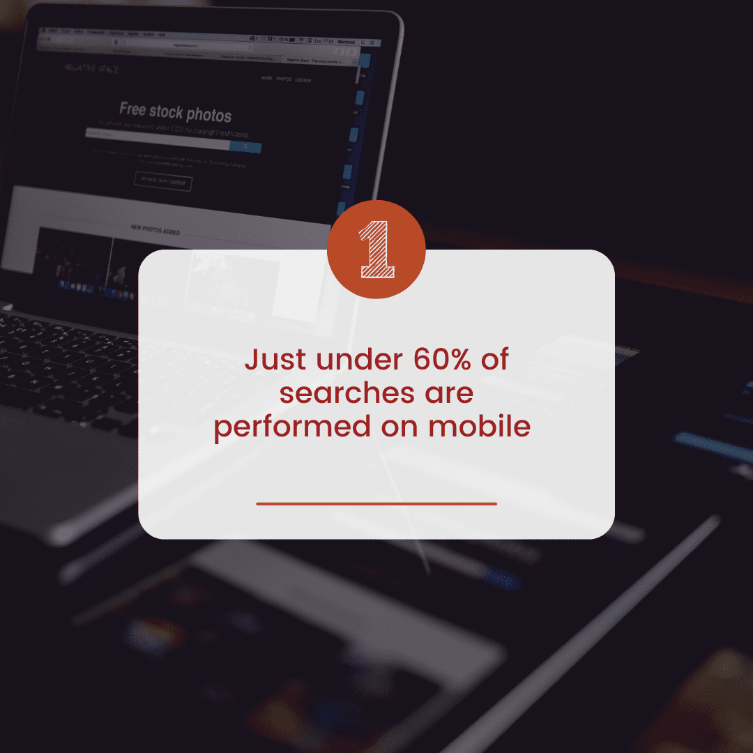
Just under 60% of search is on mobile, about 2% on tablets and less than 38% on desktop.
So if the users searching for, finding and visiting your website are on a mobile device then you need to ensure that you are giving them the best experience possible.
If Google does not deem your website to be mobile-friendly then it will not show your business in its search results.
Being shown in search results is the best way to be found online.


Responsive design leads to all the things that get results for our business:
- better readability
- users spending more time on your website
- better interaction
- and ultimately more sales
Top Tips

We do love some good tips, here are our top 3 to get started with checking your website is mobile friendly

Keep it SIMPLE – Simpler designs work better in general, but in particular they function better than complicated layouts on smaller screens
TIME – Avoid unnecessary video or images so that your site loads faster, especially on small screens


VALUE – Your website should be useful to visitors, regardless of screen size, so don’t let a non responsive site design get in the way of you providing value for your potential customers.
What are the key factors to a mobile-friendly responsive website? (The Techy Bit!)

Let’s get (a little!) techy.
What are the key factors to make your website mobile friendly? Here are a few, just for starters!
All of your content should fit on the screen.
Tap targets (links for touch screens) need to be bigger as users are clicking on them with a finger rather than a cursor.
Images and text sizes should be reduced to fit the screen in a reasonable and attractive way.
Phone numbers should be clickable to call directly from mobile.
It should still feel easy to move around the site and reach the desired target – buy a product, fill in a contact form, etc
What next?

If you are not 100% happy with how your website works on mobile why not book a call and talk to us about how you can get the results you want?

